Duration
14 weeks
14 weeks
Problem
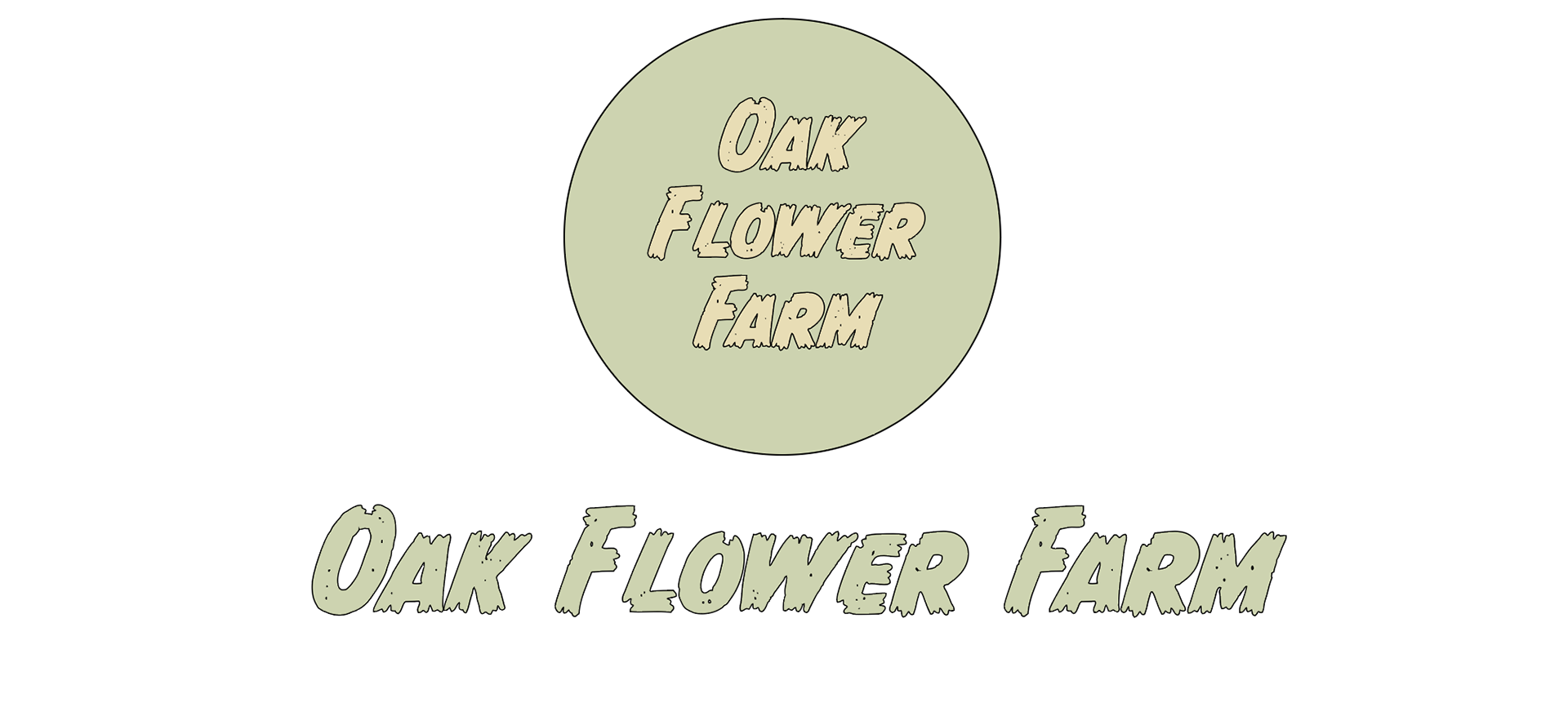
A need for a business logo for a seedlings and farm operations Business Identity System. A simple, recognizable black and white emblem for distribution of botanical plants.
My Role
Design some or all of the following logo components: main, dynamic, alternative, mascot combination, emblem, letter mark, pictorial and watermark varieties of logo for client. Also design a pamphlet document to inform neighbors of the home stand nursery we have for them to purchase from and enjoy at their own.
Solutions
The solution to the problem is creating a Brand Identity System (BIS) from start to finish for Oak Flower Farm. I created a logo that the client liked. I also developed a logo to go on their letterhead. In addition, I took photos to document their production processes and showcased their deep family-oriented values in the visual aspects of their design to cater to their target audience.
Research
I did a competitive analysis of local farmer’s markets, surrounding farm cooperatives, and as many agricultural companies in the Eugene, OR region that I could locate.
Challenges
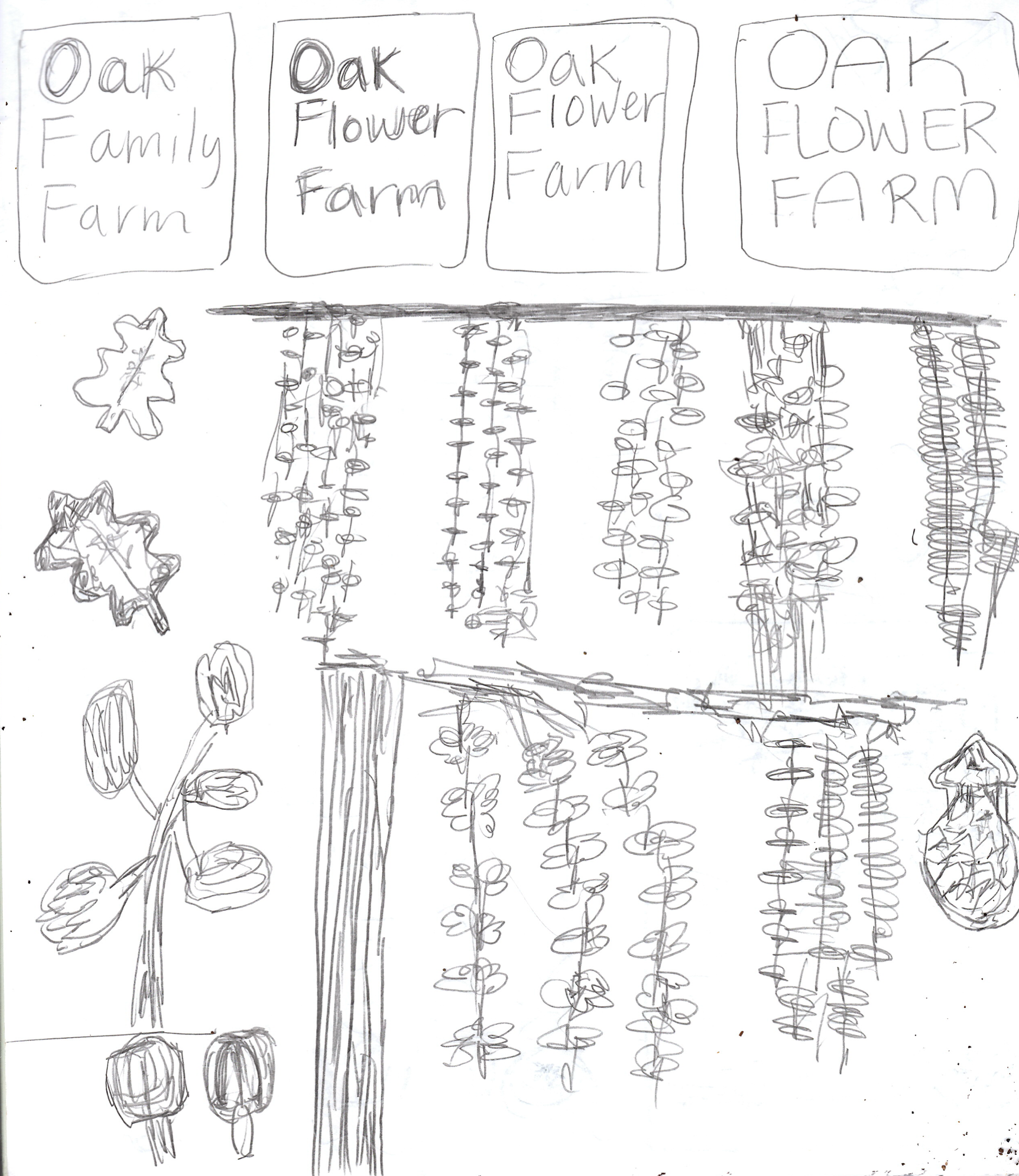
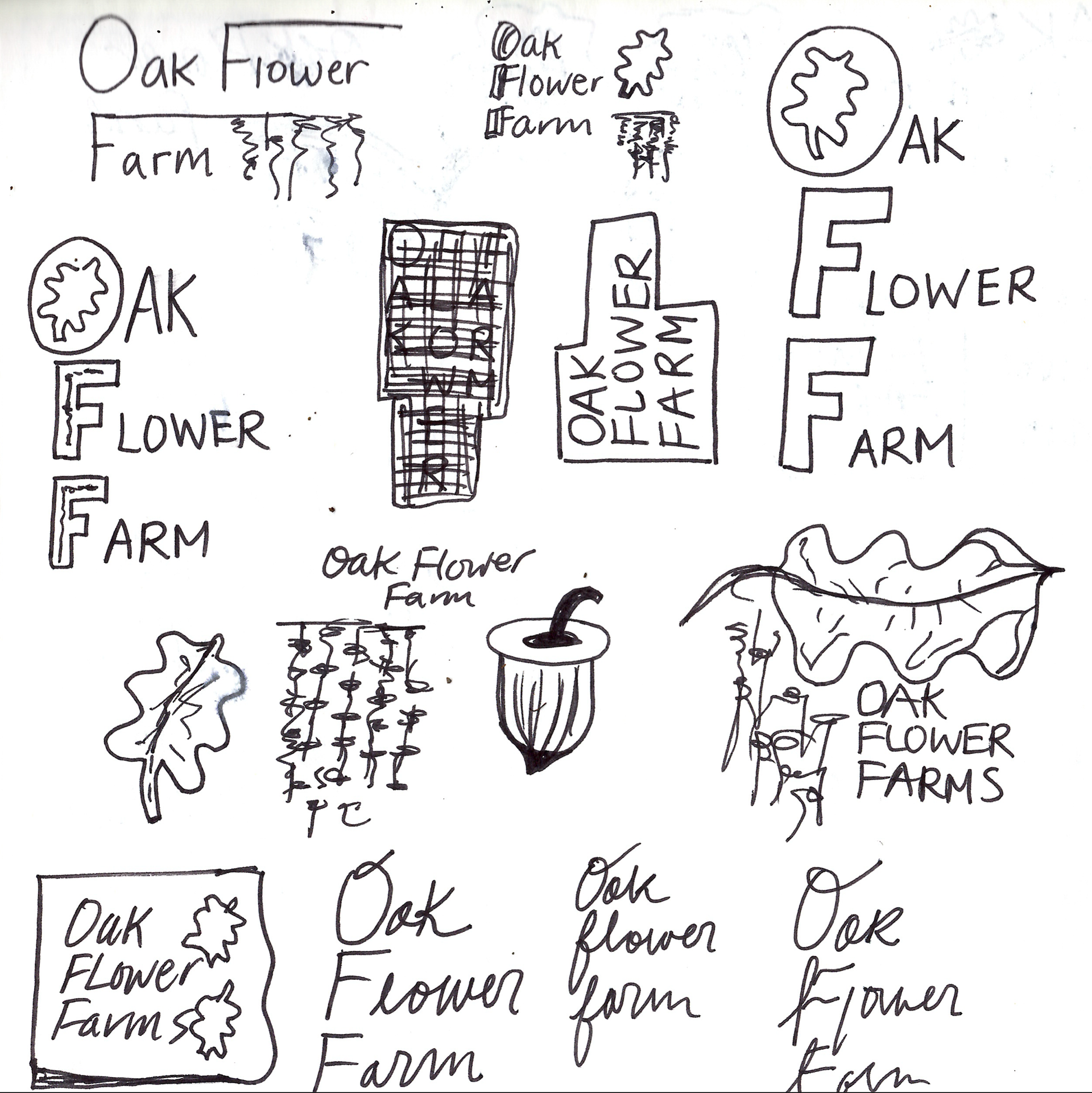
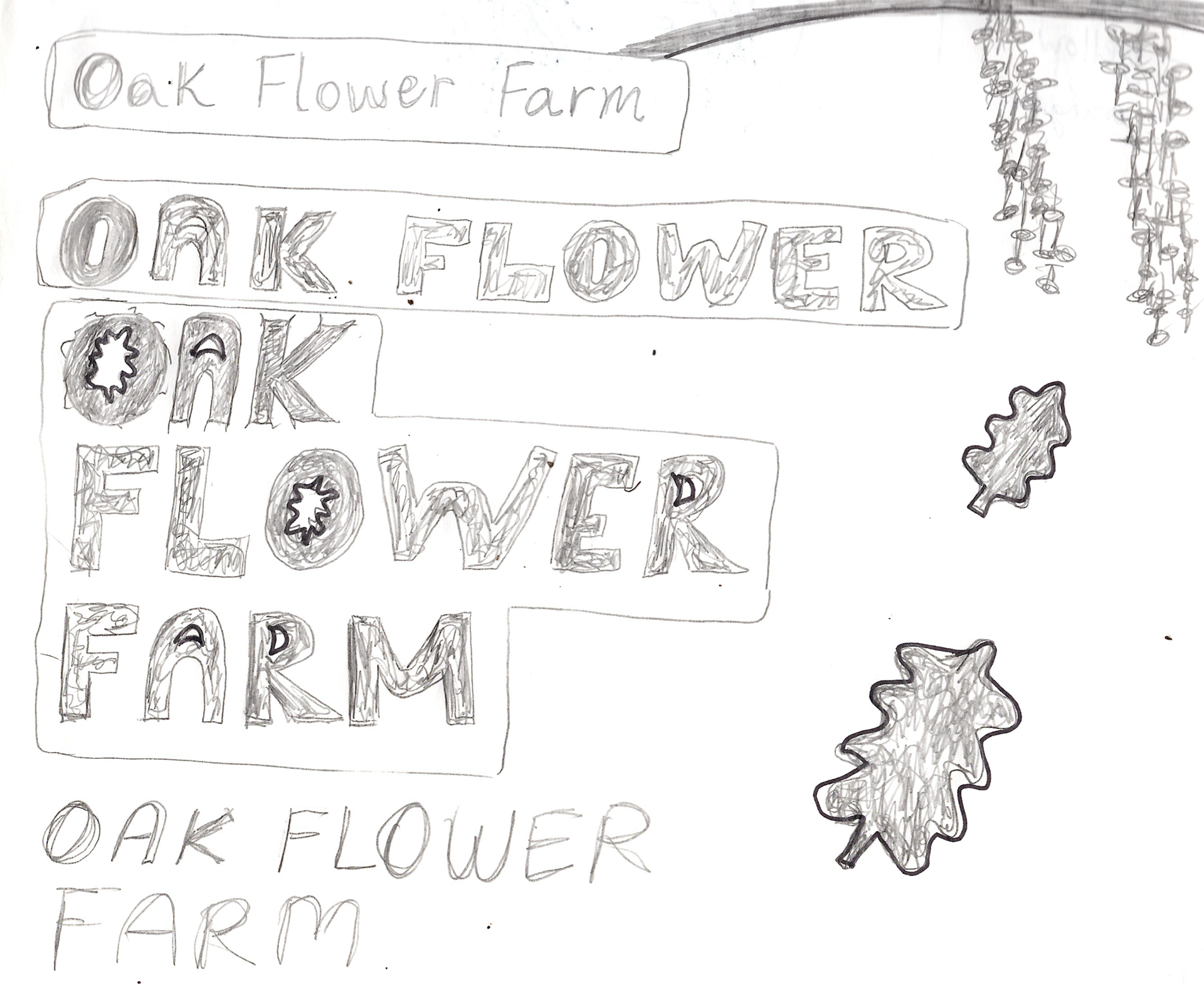
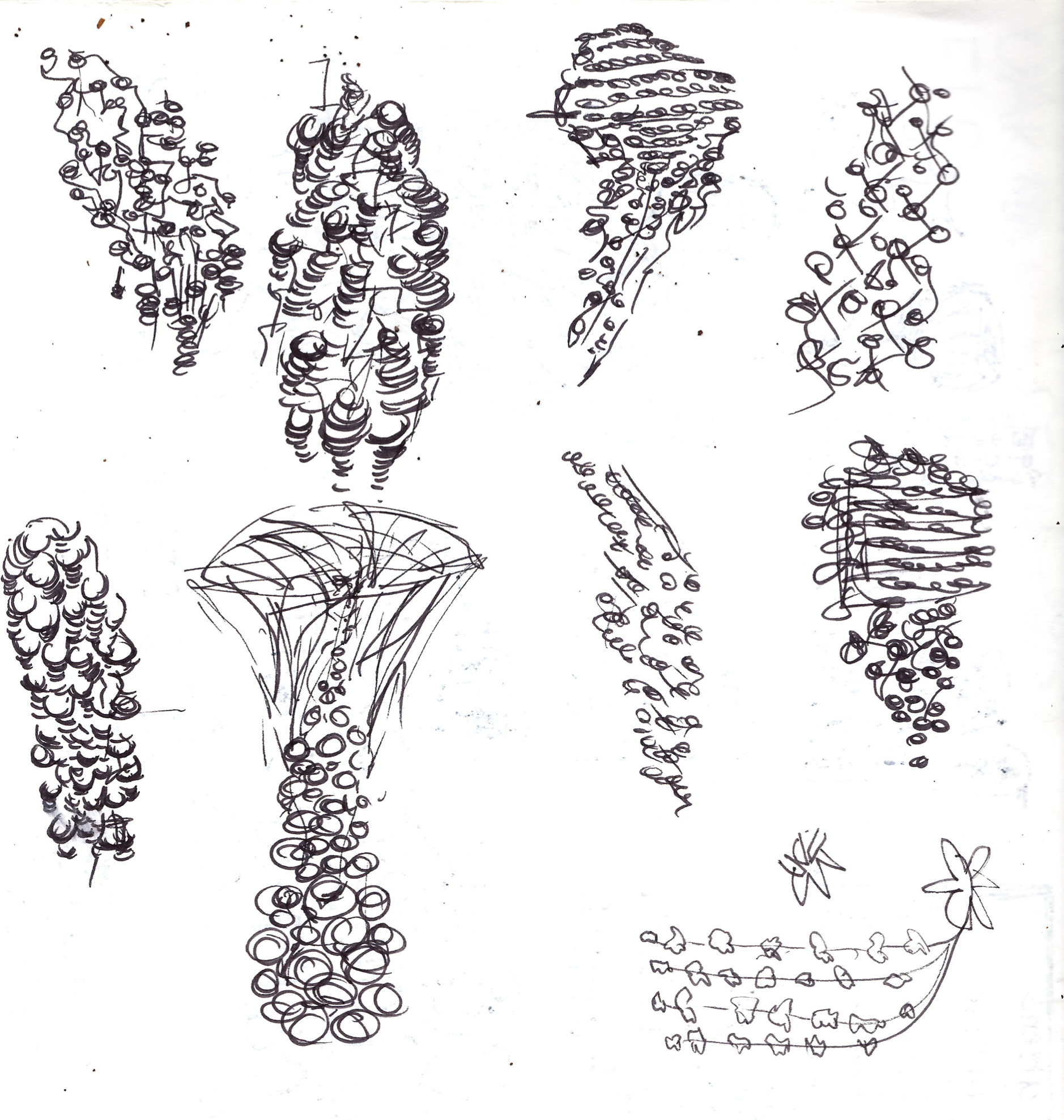
The client was not satisfied with my first iteration of typographic styles. I picked serif and san serif styles at first. The client wanted a more scripted and cursive style typeface choice. Additionally, the client wanted actual Oak “flowers” or “buds” within the logo, instead of an “oak leaf” silhouette.
Learnings
I learned that choosing a typeface for a client’s logo takes time and reiterations because when presenting them with options, they do not always like the typeface style. I learned that creating a logo is very time consuming and requires a lot of testing and refining to rinse and repeat all steps until a final product is achieved and the client is satisfied.
Programs
Adobe Photoshop, Adobe Illustrator, Adobe InDesign, Instagram
Sketches + Concept Development
alternative mark
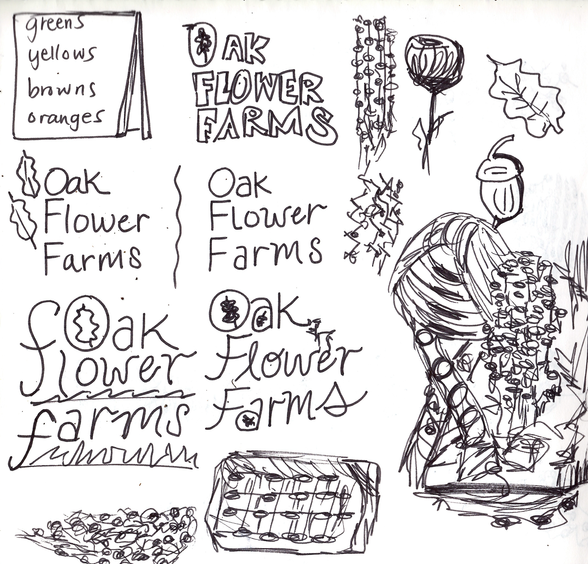
Typography + Color Palette

Tri-fold pamphlet
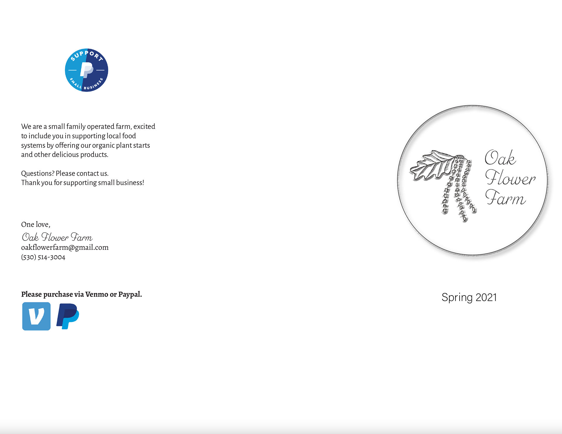
outside
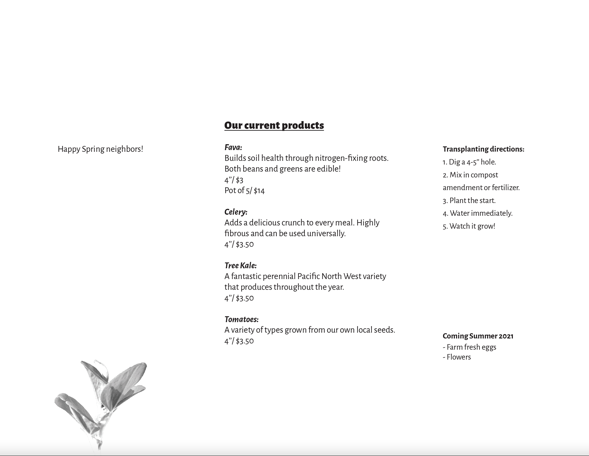
inside
Main Logo